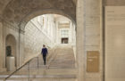
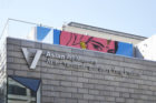
In 2003, San Francisco’s Asian Art Museum (AAM) moved into its new home, a more than century-old Beaux-Arts style building designed to be a public library. Since its opening in 1966, the museum had occupied a wing of the de Young Memorial Museum in Golden Gate Park, but a city hall plan to revitalize Civic Center envisioned AAM as the ideal tenant to replace the relocated Main Library. A renovation for the landmarked building, conceived by the Italian architect Gae Aulenti, made for improved circulation, but left the museum in need of a comprehensive wayfinding program.
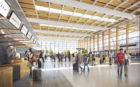
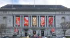
In 2016, AAM asked SOM’s Graphics + Brand studio to develop a new graphics and wayfinding program to correspond with AAM’s new round of expansion and renovation — led by the architecture firm wHY — which included a 9,000 square foot exhibition gallery along with an updated museum entrance lobby, classrooms, and collection galleries. Fresh off of a similar project for SFMOMA and their Snøhetta-designed expansion, SOM’s San Francisco-based studio was ready to help find creative solutions for another local museum’s needs.
Originally planned for May 2020, AAM’s reopening was delayed until July 2021 due to challenges related to the COVID-19 pandemic. After a close collaboration with AAM, a new system of signage and wayfinding now reinforces the institution’s brand while also visually clarifying and unifying its original building with its expanded space. “The new wayfinding and graphics are very elegant, consistent, and easy to spot,” says AAM director and CEO Jay Xu. “It feels very fresh and I believe it will stand the test of time.”
Lonny Israel, who leads the Graphics + Brand studio, sat down to discuss his team’s work at AAM — from developing a way for visitors to find each gallery and functional space, to designing a unique set of pictograms.
How did SOM’s Graphics + Brand studio get connected with the museum?
The museum world in San Francisco is a close community. We had completed our work for SFMOMA and our client there had been talking with the director of the Asian Art Museum, Jay Xu. Coincidentally, he had been through the SOM office before, so we had already met and he was familiar with our work.
What were the issues with the existing graphics and wayfinding?
Circulation had been improved from its days as a library, but there were still navigational challenges. As a visitor, it was difficult to understand where you were supposed to go, or where the museum experience even begins.
The museum had a signage program as part of the initial move-in, but it was developed in a time when less importance was placed on the visitor experience.The desire had been to have the least amount and most discreet signage possible. As AAM evolved and their programming changed, well-intentioned homemade signage began to proliferate and visually clutter the museum. So once they had a rebrand, the signage was not only a mixed bag but it also had the wrong logo. That’s where we came in to help translate the brand and identity into a new graphics and wayfinding program that would meet the needs of the expanded museum and better serve all of its visitors.
Often we strive to integrate the wayfinding program with the architecture, but in this case the architectural context is constantly in flux, from the historic library to the previous addition to the collection galleries. So the wayfinding program was designed to be a constant voice throughout and is seen as a layer that floats (sometimes literally) on top of the architectural surfaces, regardless of their era.
What was the level of collaboration between SOM and AAM in developing that identity?
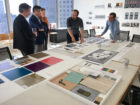
We collaborated closely with a core working group from the museum. We tested our ideas with the architects at wHY, and then with larger museum stakeholders, including curatorial, visitor experience, facilities, communications, and development groups. The process involved balancing the various stakeholder perspectives. We held numerous meetings to build consensus at each key milestone.
What did your team identify that the museum hadn’t picked up on before?
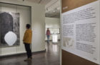
When you’re so used to something, you might not see what someone just visiting instinctively sees. I think the museum hadn’t realized how many visitors didn’t know how to take in the collection. We noticed people would go up to where the permanent collection is located and walk right past the entries to the galleries, thinking they were closed. That’s because there wasn’t any signage clearly identifying these thresholds.
How much is site observation part of the design process?
We were in the museum for a substantial amount of time because we had to take inventory of all the types of signs that they had. We were taking photographs and documenting existing conditions and then developing journey paths for different types of visitors (for instance, someone who just wants to go to the cafe, or someone who just wants to see the current exhibition). There was a fair amount of diagramming and then going back on site and retracing steps to make sure our proposed solutions were the right ones.
You mentioned that AAM already had a new logo. How much of the design process involved making sure that everything felt like it was in harmony with elements you weren’t designing?
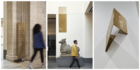
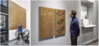
We thought it was important to reference the ideas behind the new identity to establish a consistent institutional visual tone from marketing and communication materials to a new signage and wayfinding program. Their logo is an upside down “A,” which, according to its designers, is a mathematical symbol that means “for all.” Because it’s upside down, there’s a diagonal leg of the “A” that nods forward to the future. We used that same angle of the diagonal leg to create folds in some of the signage forms, a subtle nod to the logo.
The typeface used throughout the signage program is also consistent with the identity standards. And we learned from the past — the complete logo is only used to identify the building and on digital media, not on every sign. With our approach, even if the museum changes their logo for whatever reason, they’re not in a position where all of their signs have to be replaced. Gold is the main color used throughout the signage program. Gold is often thought of as illuminating, sacred and precious; it’s also reminiscent of the gilding on many of the museum’s treasures. The timeless quality of gold seemed appropriate for a signage program that leads visitors through a collection that spans 6,000 years.
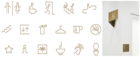
Pictograms always look so simple, but there must have been a back-and-forth on at least one of the symbols your team came up with.
We went through a few iterations on the pictogram for the café. The new operator was going to be offering contemporary Asian street food. We had initially drawn a bowl with chopsticks placed inside, but chopsticks are never left inside a bowl; they rest on top or preferably beside it. Ultimately the design evolved into a bowl with steam. That sounds like a simple fix but even with something as small as that, it’s all part of learning from our clients and getting the input we needed from across all the various groups that we met with.
What was needed for the signage and display text for exhibited works?
It was a matter of developing a family of interpretive elements that included everything from gallery introductions to the labels for each artwork. The designs needed to allow for varying lengths of text, translations, and diagrams, so we needed to design a system that met all of the criteria while still appearing simple and straightforward. We wanted that content to be approachable and legible, not to feel like you were studying.
What are the lessons or innovations that came out of this project that you’re eager to put to use in upcoming work?
We wanted the signage program to have a crafted feel. We have the identity on the exterior of the building in a hammered metal. And then the wayfinding signs are metal but with a layered quality to the gold color. It was intended to complement and defer to the artworks you’re seeing. This approach was our way of making a distinct system for AAM. With every client, we strive to develop a unique solution that could only ever be for them, something that feels almost inevitable when it’s completed.
What were some of the bigger challenges in seeing the project through?
Collaborating with the museum was the best part of this commission. They allowed us to explore myriad design ideas and supported our process at each step. But when the pandemic hit during the beginning of the construction phase, its impact almost doubled the planned duration. With the construction of the expansion and renovation of the galleries delayed, the client (and really everyone involved) at different times took on the role of project spirit leader, keeping the team focused on the reopening and the museum once again sharing its ancient and contemporary treasures to all who visit.
Learn more about our Graphics + Brand studio.